Designing EGG for Mobile Experience.
@Shalinikaushal_|December 3, 2021 (4y ago)155 views
What ECG Diagnosing in Mobile taught me about designing for international markets at Tricog.
As a UX/UI designer at Tricog working in the Product team in India, it’s my job to come up with design solutions for Tricog products across the globe. We constantly see how cultural context, infrastructure, and on-the-ground realities matter to good design.
The problem
My team recently dealt with a good example of certain challenges. The question was a simple one: How could we better deliver the services of the Tricog platform on mobile screens in which the doctors can easily diagnose the ECG case?
To better understand the problem, we first did a little background on web vs mobile software:
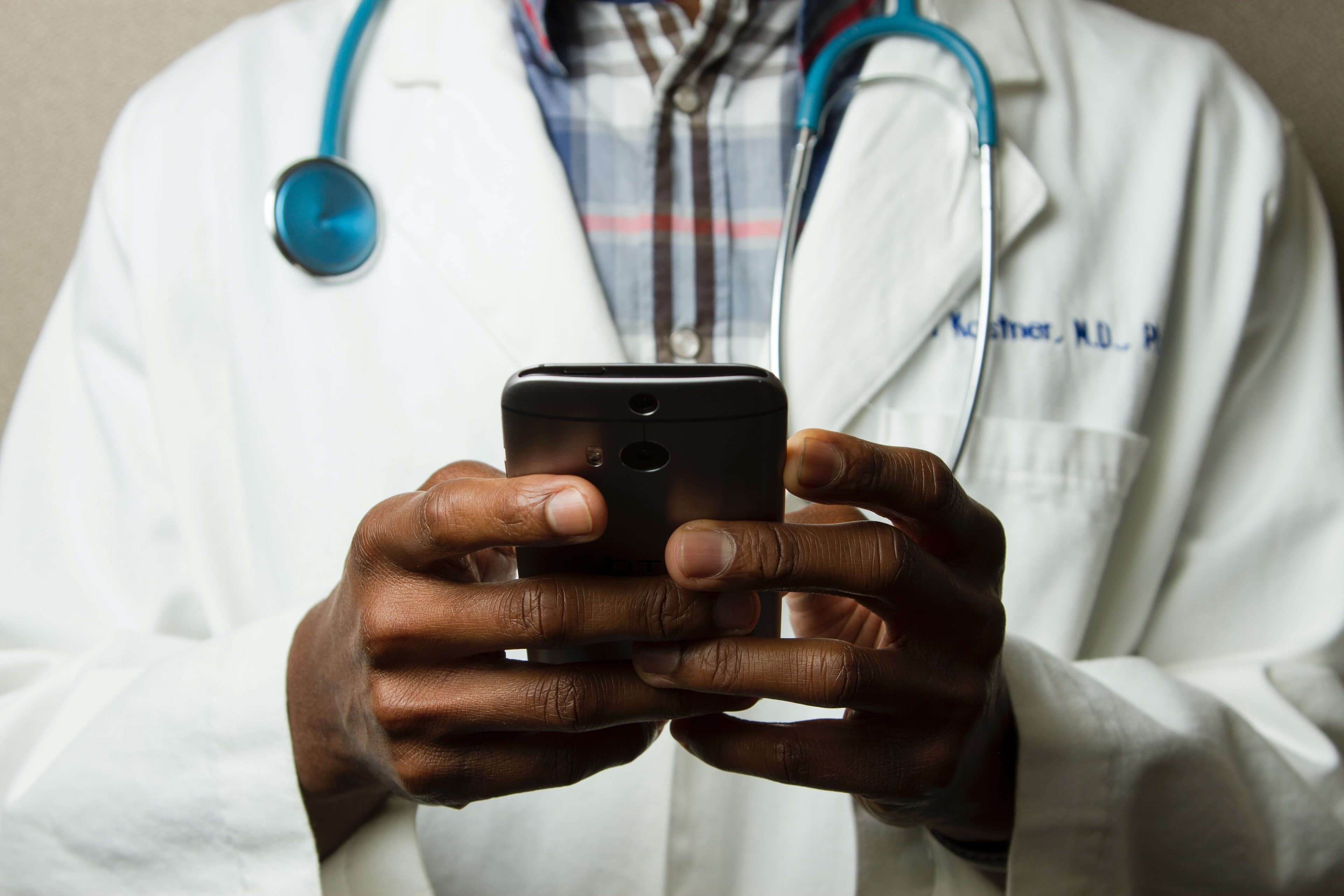
In the MedTech industry, doctors often use the software on the web to diagnose ECGs then mobile. But as healthcare is an incredibly competitive and fast-moving sector, it is common that doctors prefer to use mobile phones to diagnose ECGs.
Things get complicated
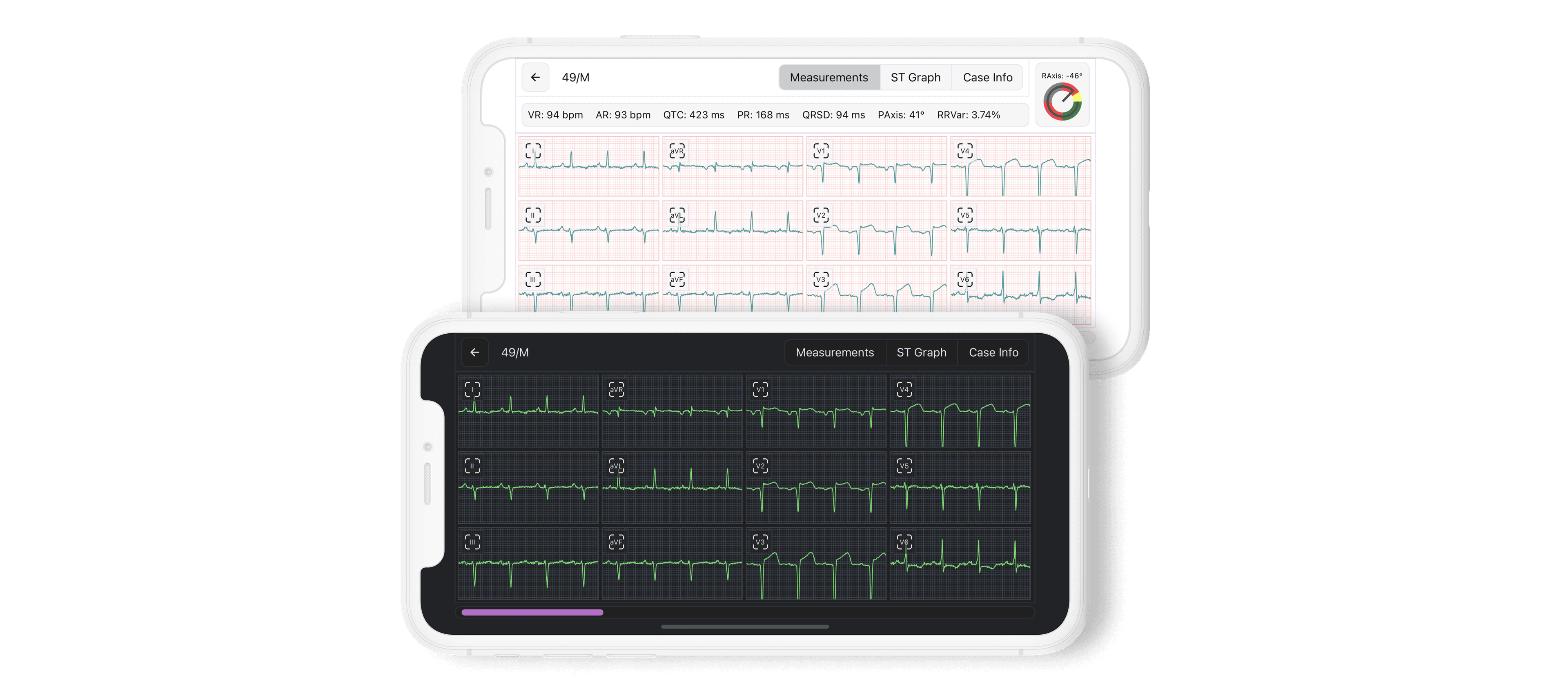
Let’s zoom in on how this challenge impacts one doctor. When a doctor has a desktop, he can easily diagnose the ECGs by taking the measurement. However, if a doctor is diagnosing the ECGs on mobile without taking measurements that would sometimes affect the time and ease of diagnosing process.
Now, let’s zoom out to see how this problem grows with the number of ECG cases. For doctors with a high volume of ECG cases, it could be a struggle to maintain the time of diagnosing the ECG case. We needed a way for doctors to quickly and easily diagnose the ECG cases in Tricog.
When we started working on this problem, the previous solution wasn’t scalable. When a doctor receives a case then he is solely responsible for carrying out the case, at which point Tricog would receive notification that the case had been diagnosed.
All of these cases were being handled via the web — there was no related product experience in the app. This was a problem particularly because there was no guarantee that doctors would diagnose all the cases on mobile easily, or quickly through the data provided by the algorithm.
Part I: On the ground
We started with the basics: researching measures on the ground in India, to find out exactly what wasn’t working.
With my product manager, I went through ECG apps, where we spent weeks working on apps to get a better example of where the current experience was falling short.

It soon became clear that one way we were falling short was in not effectively classifying information. There was an overall lack of accessibility to how handling ECGs when it came to mobile viewers. We needed a better way to communicate.
From our research, we knew we needed to accomplish three things:
- We needed to design a system that provided doctors with more control and flexibility on calipers, where, and how much they want.
- We needed to be able to guide doctors through the diagnose process and provide results on the status of the case.
- We needed to provide more accessible and thorough information to experience doctors about the mobile viewer.
It became clear that handling more of the ECG cases inside the app would play a crucial role in streamlining the process and making things easier for the doctor. In short, we needed to create an in-app collection framework that would satisfy these three needs.
Part II: Bringing it in
During our research, we sat down with volunteer doctors to get their thoughts and feedback on some of our ideas. In many of the sessions, doctors would interact with a design we’d developed. We’d pull over the mobile, load the cases onto a test Android and IOS device, and ask the doctor to use it on their phone.
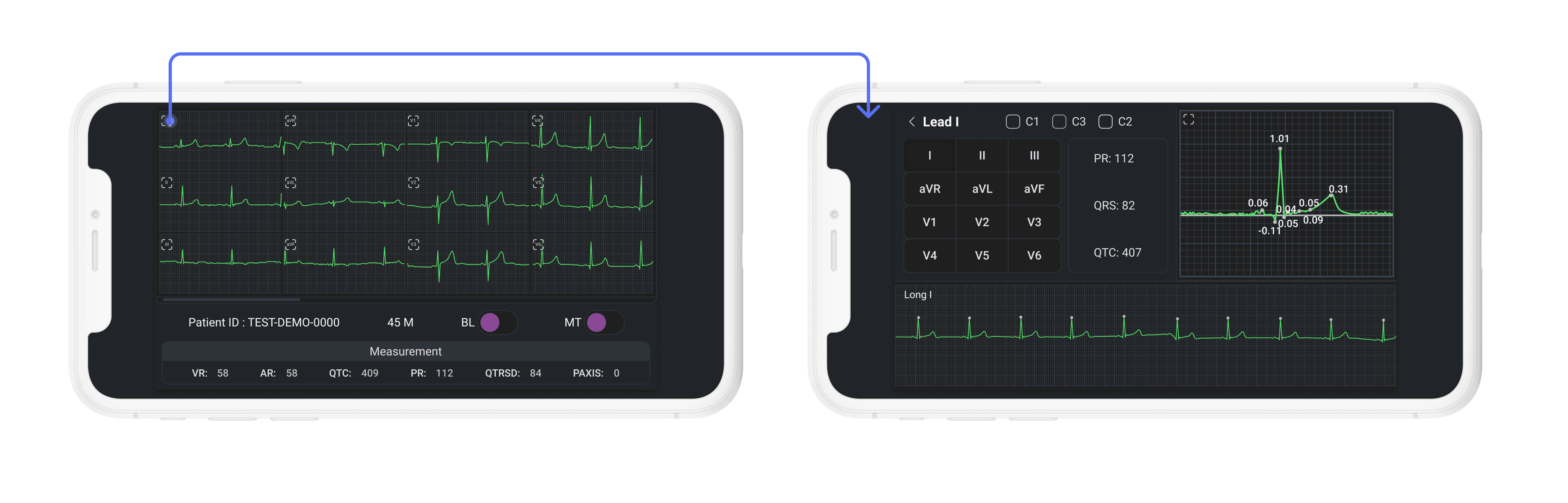
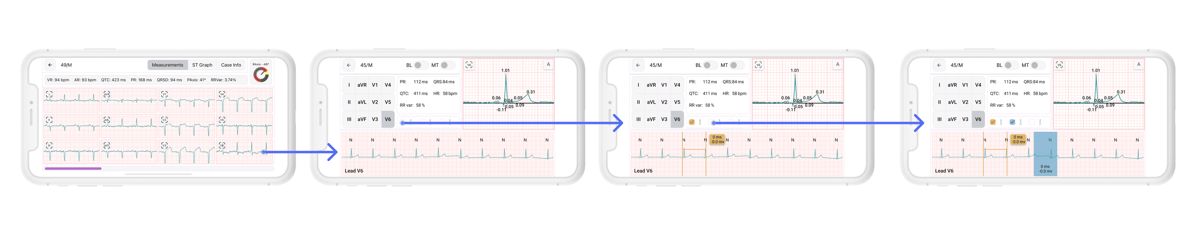
In the app, doctors first confirmed what information they wanted to know at any given time. Then a code would be generated that they could use to measure at a convenience point. Once they’d taken the measurement, they could take another measurement without deleting the previous one, and they would see a “highlighted” value to communicate the measurement of the graph.
After interacting with the flow for the first time, doctors would often tap through the screens briskly, or completely understand what was happening at each step.
In some cases, doctors mentioned they would take measurements immediately for the critical cases, to find out the problem in the case, even though, (we provided algorithm measurement on the screen) they are not confident at all!
Part III: Refinements
After doing user research I collected all the data and began refining the experience. We experimented with step-by-step instructions, pre-flow information, flexibility around starting diagnosis again, data and calipers, and contextual help during first experiences.
The main issue we saw during our testing was that some doctors would go to the end of the app without actually drawing any calipers. To account for measure algorithm measurings to help doctors if they had accidentally gotten to the end of the app without drawing calipers: we enabled three calipers for each screen, switch between the screens, and allowed them to view their measurement from the “previous'' selected area so that they measure algorithms graph and take the corresponding measurement.
What we learned
In addition to the satisfaction of coming up with a workable solution to the problem, this project offered some valuable lessons in design:
Design for people, not for users
As designers, when we think of “users”, too often we picture someone interacting with our product exactly as we would wish them to, understanding all of our expectations and taking for granted the same things we do. But this idealized user does not exist, because those interacting with our product are people, and in real life — as we saw with doctors speeding through our in-app ECG viewer — people are unpredictable, and we need to design with that unpredictability in mind.
As long as it’s clear, it’s okay to be complex
We often conflate clarity with simplicity. We shouldn’t. They are two different things, and while simplicity is often preferable to complexity, sometimes a degree of complexity is necessary when you are dealing with a more complicated problem.
“Ignoring complexity in favor of forced simplicity doesn’t help anybody. Instead of trying to ignore complexity, try to deal with it as clearly as possible.”
We did this when we offered to let doctors view their ECG cases or take measurements from the graph, in case they didn’t actually satisfy with algorithm measurement. Ignoring this problem would have been simpler, but it wouldn’t have led to a better solution.
Localization ≠ Translation
A big lesson that was reinforced for us with this project was the importance of localization. This was a product that would eventually be released in multiple markets, including the Philippines, China, Singapore, Malaysia, and India. During the design process, we’d been writing the copy ourselves in English, thinking that we could leave translation towards the end and do it just before testing. But localization — even when only considering the linguistic aspects — is more than just translation. Culture and usage may alter the intended meaning radically, or render it entirely nonsensical. And this is very difficult for a non-native speaker and cultural outsider to fully mitigate without inside help.
What’s needed instead is “transcreation”: adapting a message from one language to another while maintaining as much as possible consistency of intent, style, tone, and context.
This is best done early, often, and with local help. Who better to ask to serve as your guide around a town than someone who has spent their whole life there? The same is true of language.
Looking ahead
Working on this project has been a rewarding experience. As we move forward and expand this product into other markets, helping other teams adapt it to their own needs, we continue to look for opportunities to improve the experience. This project has been a good reminder for me that our “users” are people; that there are worse things than a little complexity; and that assumptions are to be questioned, not relied upon. Keeping these in mind can only make for better design.
Special Thanks to the Product Team for collaborating during implementation of Tricog Atlas Mobile:
- Bipin Mood — Product Manager
- Shweta Kaushal - UX/UI Designer
- Zacharias Manuel — Mobile Architect
- Anish Kumar – iOS Developer
- Yureka M R – Android Developer
- Anupama Singh – Assistant Product Manager